
The story behind a successful campaign…
or how to break with convention…
Already 20 years ago…
The brief from CMN was clear — and represented a genuine challenge:
How to communicate for a shipyard mainly known for its "grey" vessels and with no recent builds to showcase…
A campaign had to be built capable of embedding the shipyard's expertise, attentiveness, industrial strength and legitimacy in the demanding and luxurious world of mega-yachts into its brand identity.
Building a mega-yacht is a lengthy process spanning several years. The campaign therefore had to be designed to last, structured as a diptych, preserving the original idea while showing the shipyard's progress:
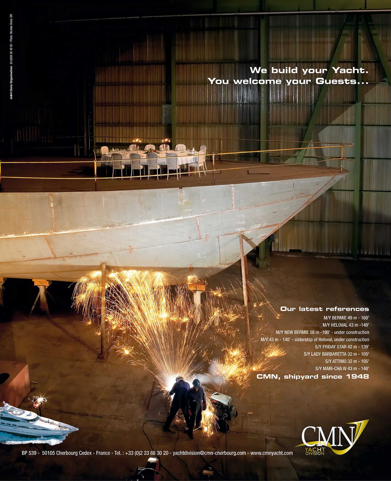
The 1st part of the campaign ran in 2005–2006.
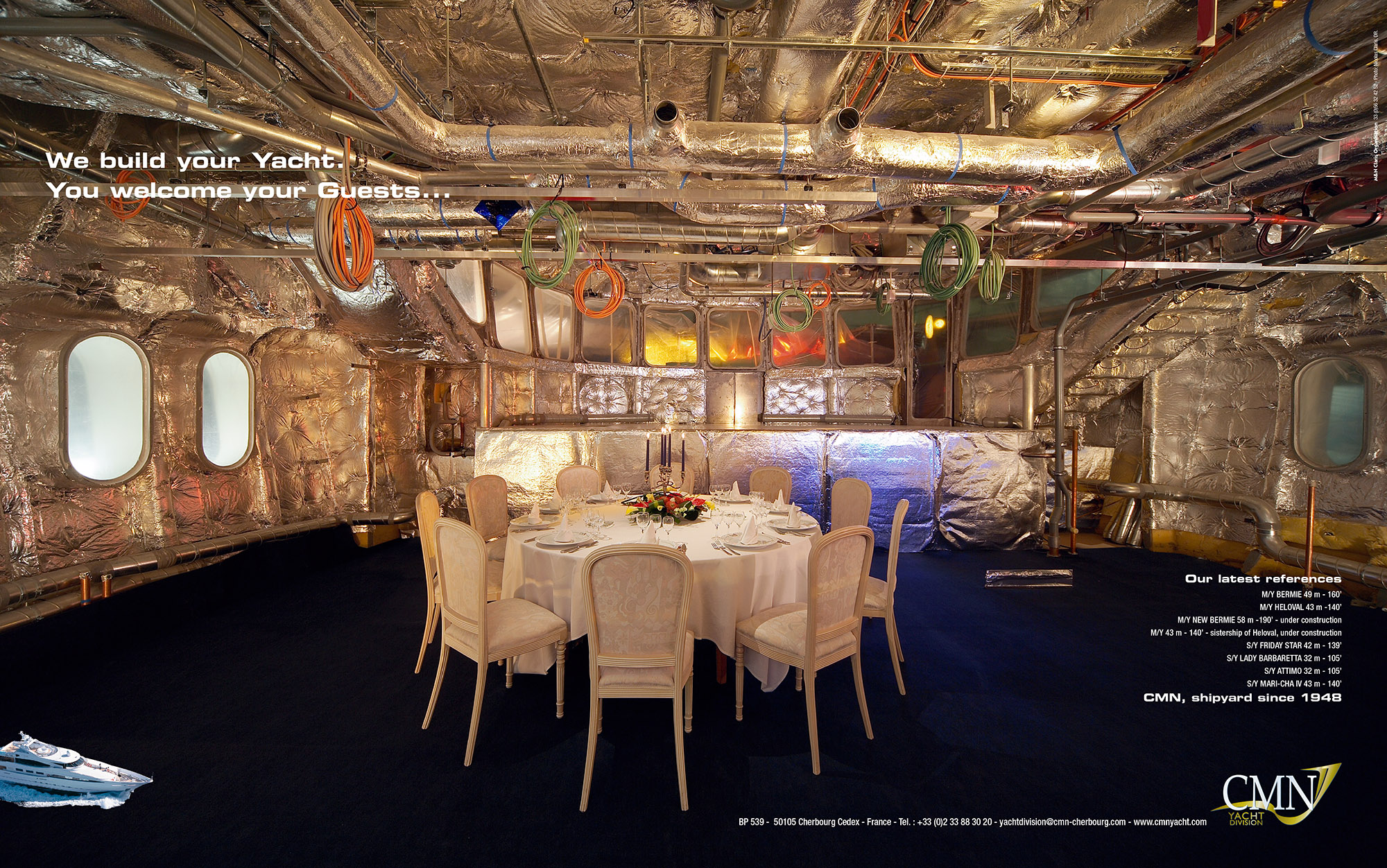
The 2nd part ran until 2007.
Agency selection and brief: Thierry Regnault
Overall organisation: Sylvie Leboyer and Philippe Gosselin
Dinner table staging: Marc Lecarpentier
Concept: Marine and Nicolas Claris
Photography: Nicolas Claris assisted by Sebastien Meys and Romain Claris
Lighting: Nicolas Claris assisted by Sebastien Meys and Romain Claris
Layout: Marine Claris
Creating a campaign that stands out from the competition, both visually and in terms of content.
Linking CMN's industrial reality to the dream and the final use of the "product".
Anchoring CMN in the exclusive world of super and mega-yacht builders.
The table, laid on the deck under construction or in the owner's stateroom — white tablecloth and candelabras, candles lit — recalls one of the uses the owner will make of their yacht. Conviviality at sea…
A way of telling the owner they will be welcome during the (two-year) construction period. Conviviality of the shipyard.
The colours, reflected in the insulation materials and piping, create a truly luminous and festive atmosphere… while remaining firmly in the industrial world.
"Free" space is deliberately preserved in the original framing for use in the final visual, so as not to diminish the image's power.
Deliberately understated, a cut-out image of a boat, positioned symmetrically with the logo, is a reminder — if one were needed — of the purpose of the enterprise.
Finally, breaking with the customary blue palette of specialist magazines, to stand out and increase visibility.